Description
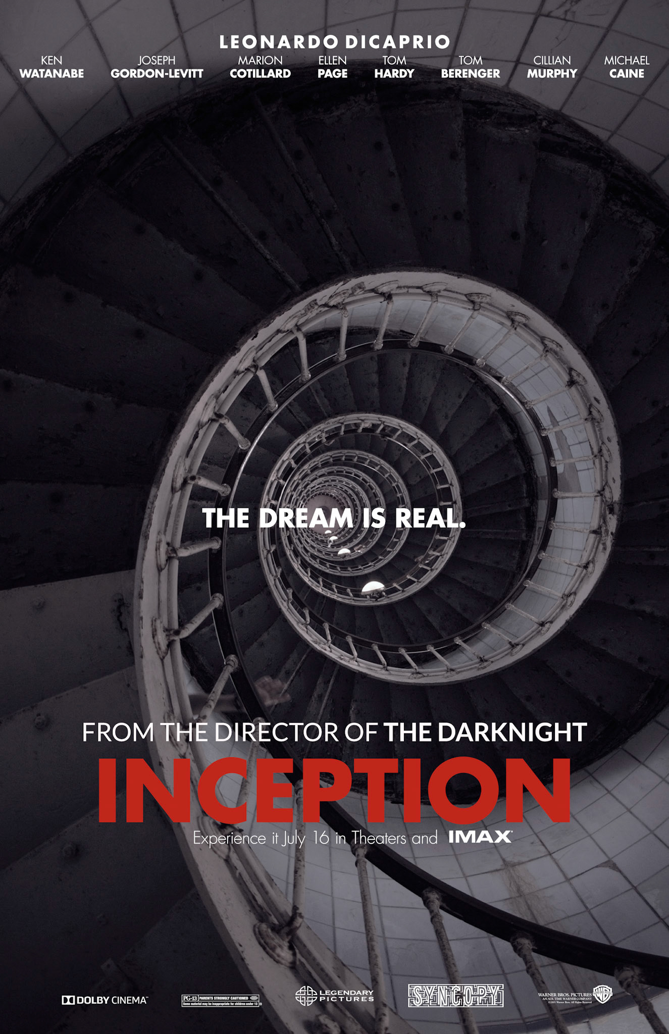
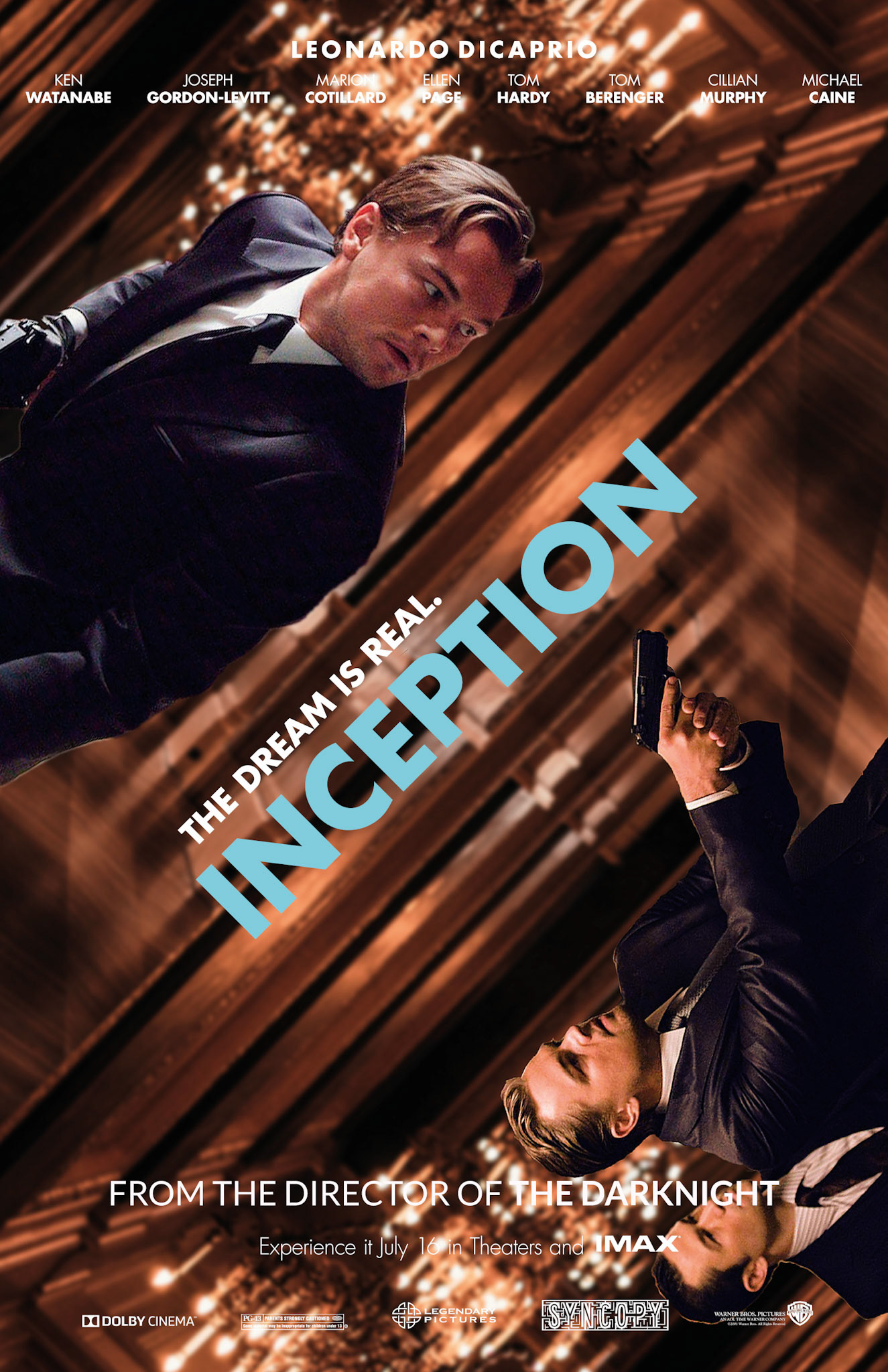
This is set of posters I designed for movie "Inception" I did for my school project. The goal of this project was to create two posters that were unique but complemented each other. In order to create these posters, I used references from the movie itself and added various visual elements that demonstrate the chaos from the movie. The use of color theory is very prominent in this design as I used the very famous Red/Blue color combination along with yellow to highlight certain elements and add dimension to the design. The colors for the two posters are inverse of each other as red is more prominent in the first one and blue acts as a secondary color, whereas it is the opposite in the other second poster.